Camping Out Indoors
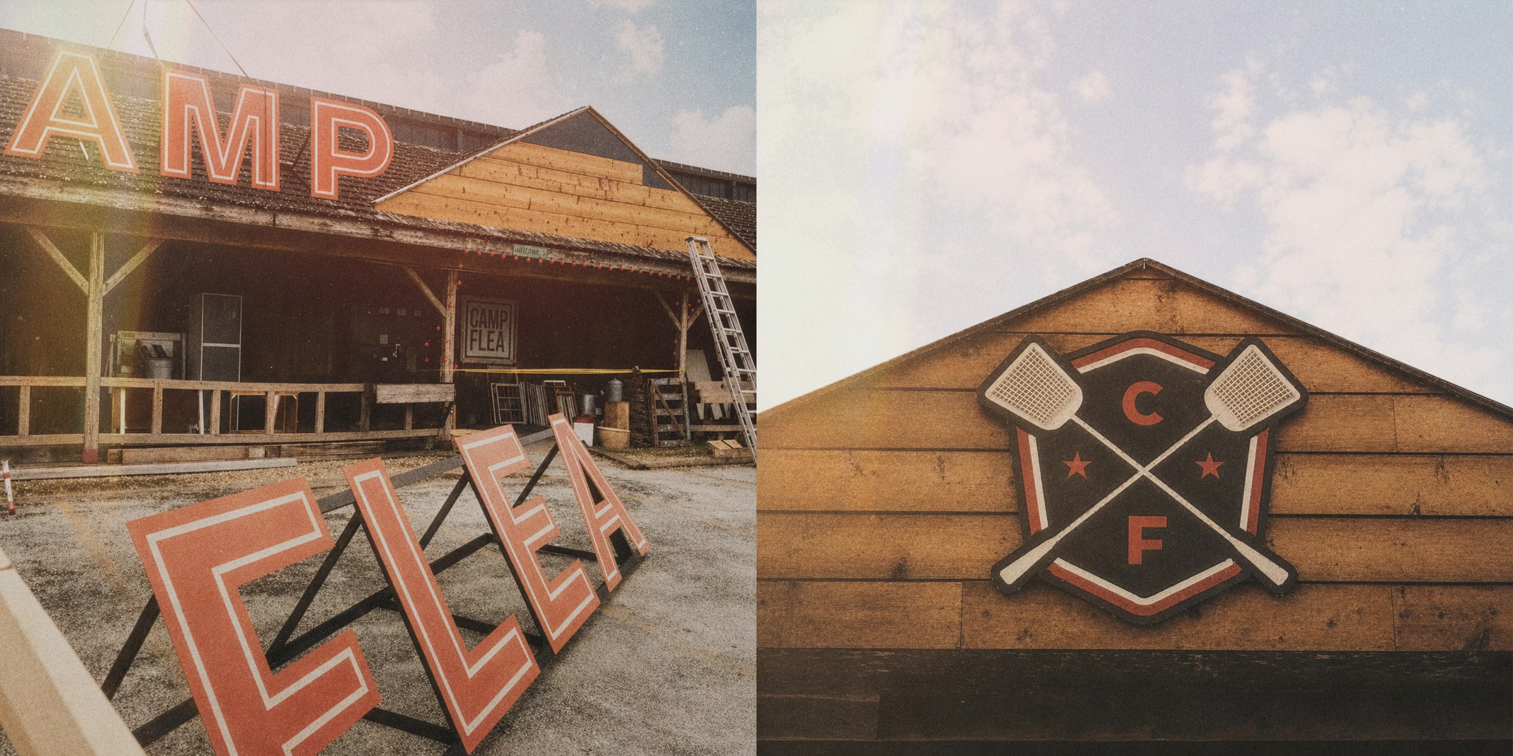
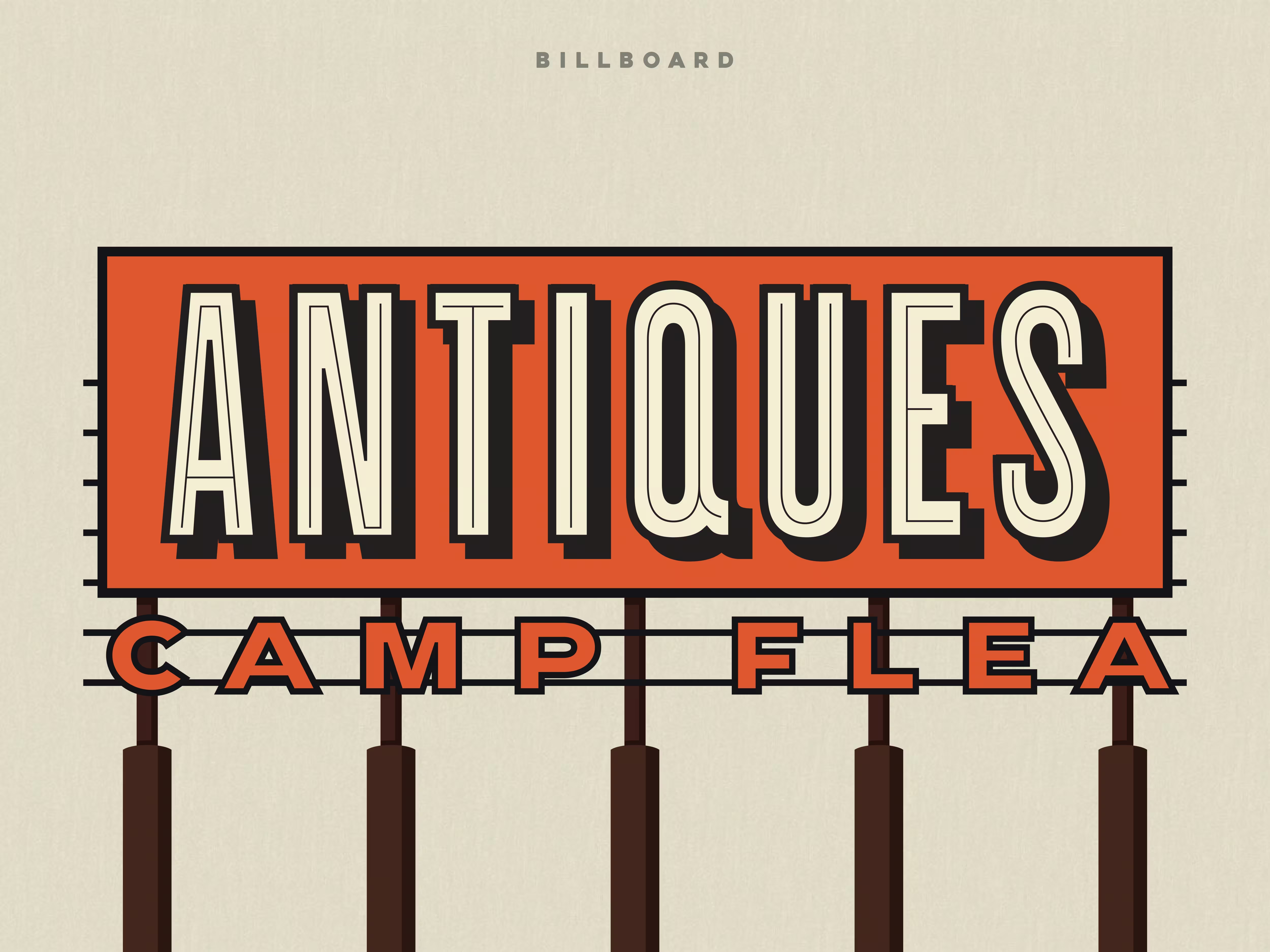
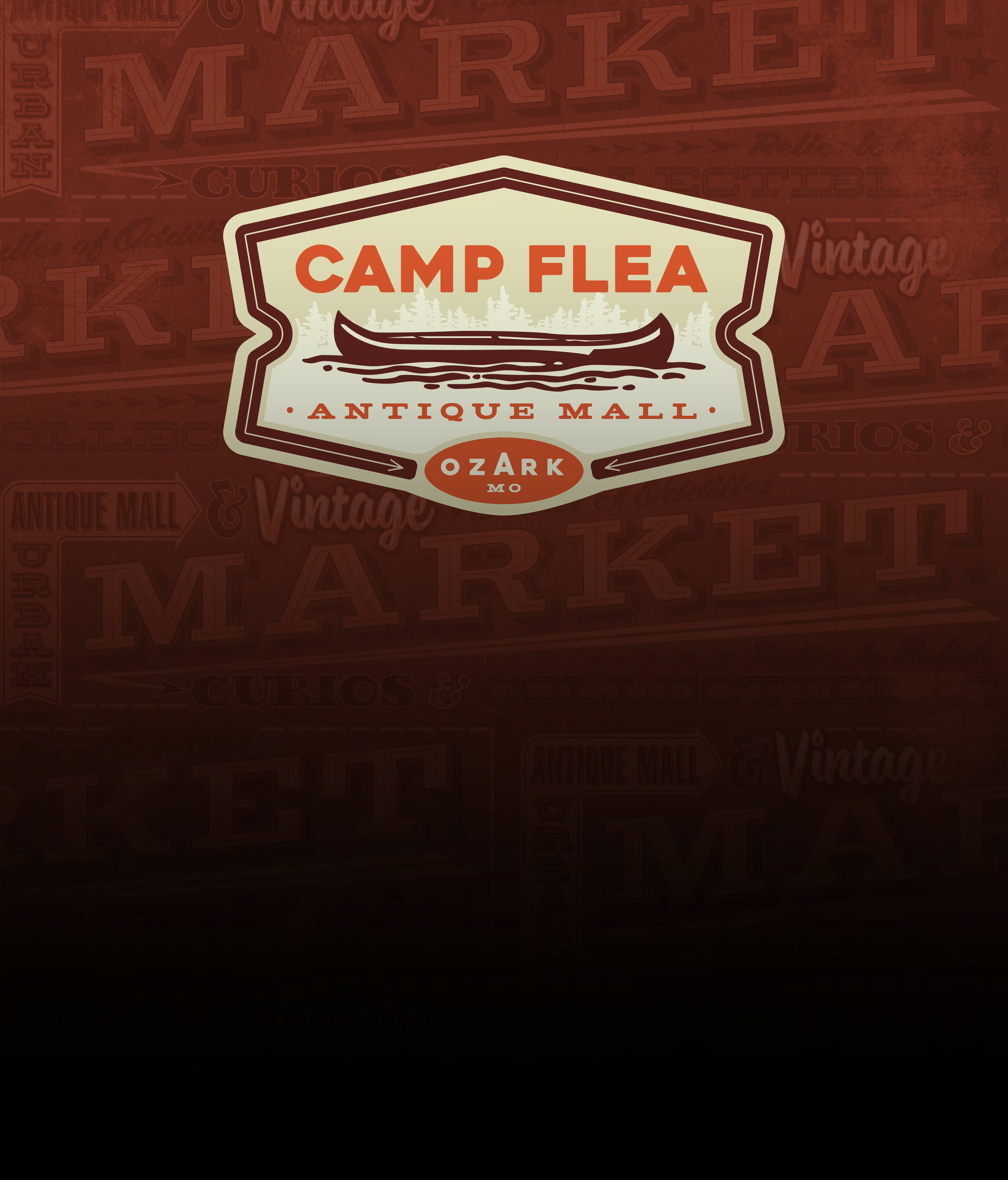
At camp, bunk beds, creepy cousins and toilet turns are nothing compared to the bugs. So when Camp Flea, an antique mall and vintage market in Ozark, Missouri, needed a brand identity, the idea was hiding in plain sight. This wasn’t just a name — it was a declaration of war. The solution turned the tables on those pesky little bloodsuckers with a mark built around two crossed fly swatters and one simple, unspoken rule: you fly, you die.
The identity pulls from the visual language of early- to mid-20th-century American summer camps — sturdy gothic sans serif typography, athletic lettering, lodge signage, camp patches, vintage pennants and sun-faded souvenir shirts. At the center is a clean shield structure designed to feel like it had always existed: part camp badge, part merit patch, part warning label. From there, the brand grew into a flexible system of marks and applications built for the great indoors of Camp Flea — tank tops, sweatshirts, ball caps, signage, environmental graphics and any other gear a camper might need while hunting for antiques, oddities, and secondhand treasures.
The final identity gives Camp Flea a world of its own: nostalgic, scrappy, a little ridiculous and completely memorable. It feels less like a polished retail brand and more like something discovered in an old footlocker — a sun-faded camp relic from a place where the cabins are dusty, the signage is hand-built, the coffee is questionable, and every trip through the aisles might turn up something strange, useful or impossible to explain.